Social design V2for your picks.
One system for carousels, statics and founder posts, built from the brand we already have: paper and ink, the blue mark, big type making one point, and real proof you can read.
Nothing has been posted, uploaded or changed. The ad and video skills, campaigns and Meta account are untouched. Everything sits on branch worktree-social-design-v2.
- Pick one slide 1 per test (next section). And if there's a carousel you like the look of, send it: your rule is that sets start from your reference.
- Ground: paper by default, with an ink slide for the turn. Recommended Or Graphite black?
- Headline face: Bricolage condensed, which is the brand face and is on the site. Recommended Or Anton, TEST1's exact letters?
- Energy: my read is not yet, by your "visual energy" bar. The grid is still mostly paper and the proof crops are small. The fix is a photo session with you, sharper proof captures and motion covers, not tape and stickers. Agree?
- Canvas: organic posts at 3:4 (1080x1440), Instagram's current max. Recommended One private test post first: Meta's API page says carousels crop to the first image, square by default. Until that's settled, 3:4 goes up through the app.
- Last-slide CTA: "Ring the demo · 0468 050 520", or no number on organic posts?
Slide 1,three directions each.
Swipe each row. My pick is first in each row.
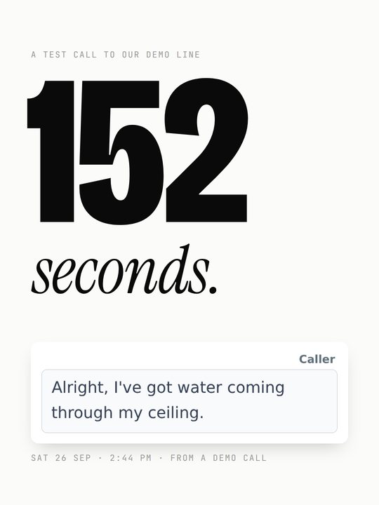
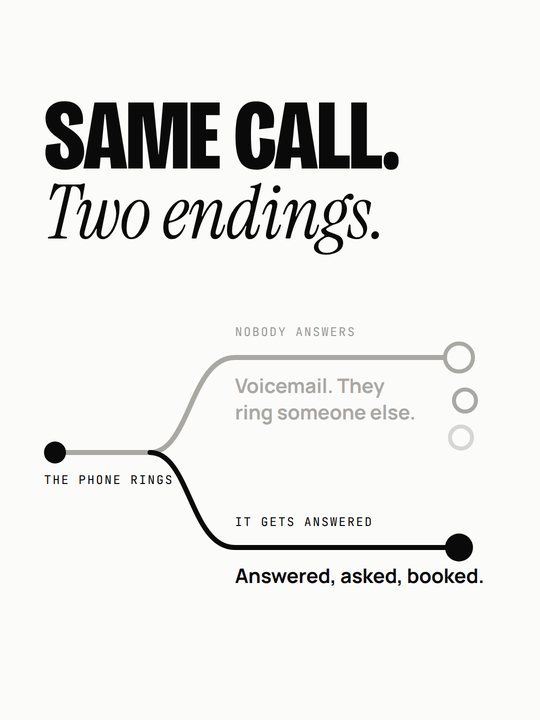
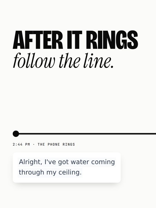
Test 1 · Managed AI systems, never leading with "AI"
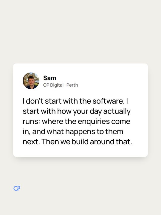
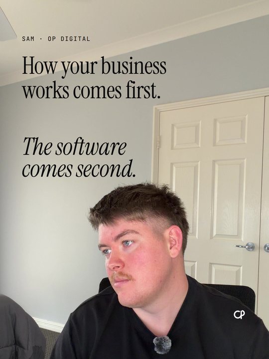
Test 2 · OP Digital, how you think
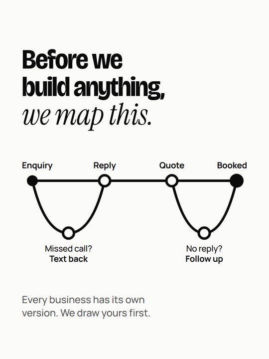
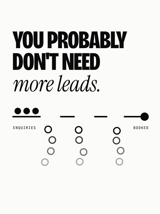
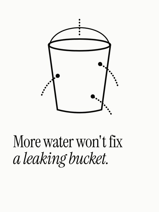
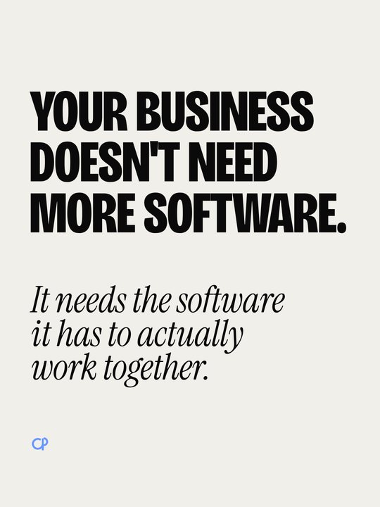
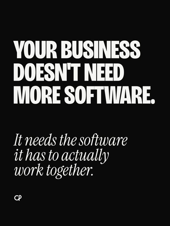
Test 3 · "You probably don't need more leads"
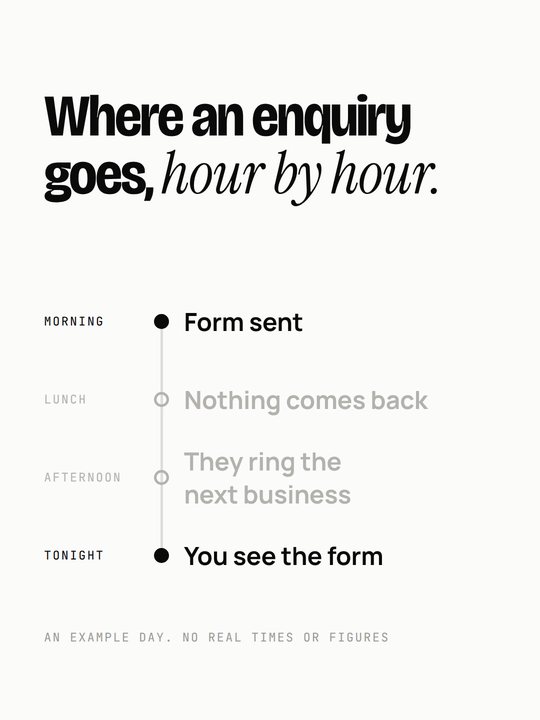
How a wholecarousel carries.
Built so you can judge the system. All 31 renders pass the automated checks: fonts, margins, minimum size, clipping, overlaps, logo clear space, and now SVG clipping and text touching a line. Two fresh reviews failed my first pass and then my first fix: diagrams that looked like sliders or steppers, a clipped ring, made-up clock times on 3C, a line through a label, empty bands. Those are fixed. The weak spots that remain (small proof crops, draft words, a quiet slide or two) are listed in the package's QA table.
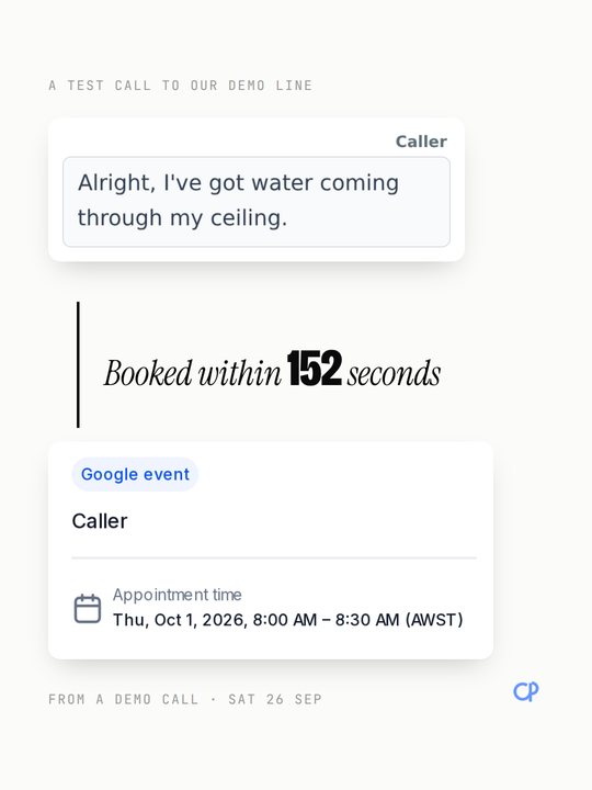
1A · 152 seconds
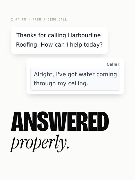
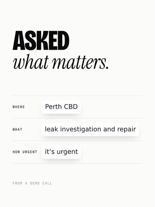
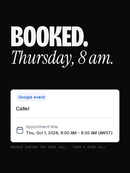
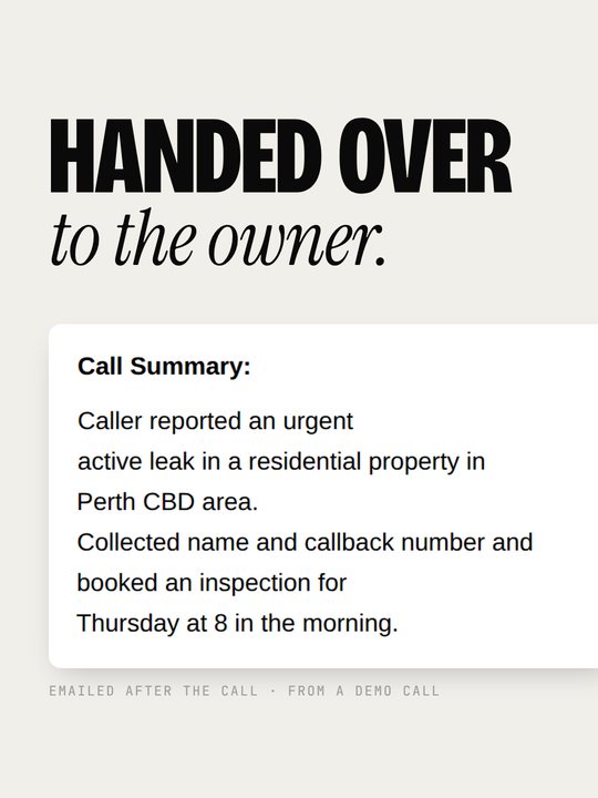
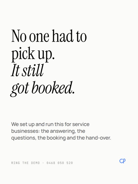
All proof is the 26 Sep demo call (2:44 pm, 152 s, booked Thu 1 Oct 8 am). The caller was someone you know playing a scenario, so every label says test or demo call, never customer.
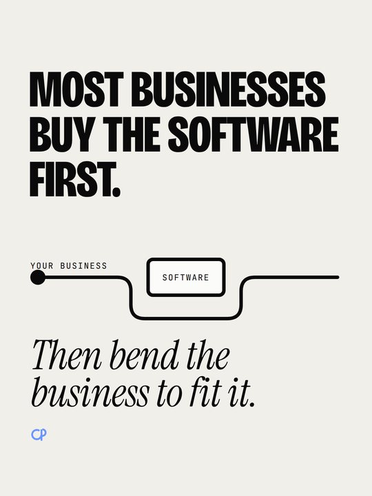
2A · The other way round
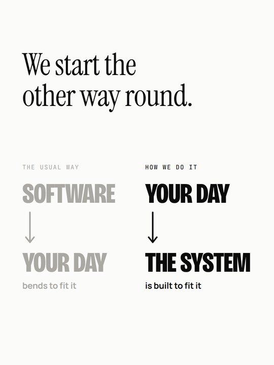
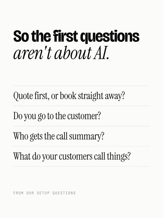
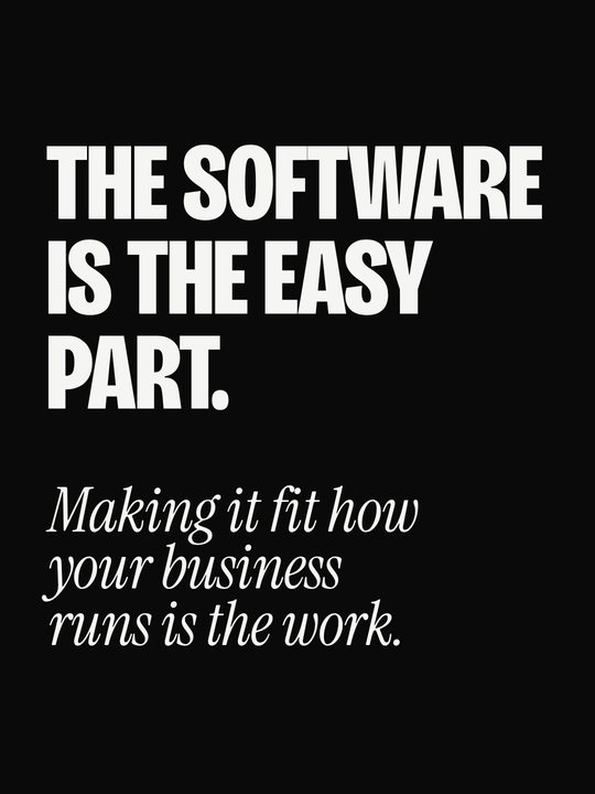
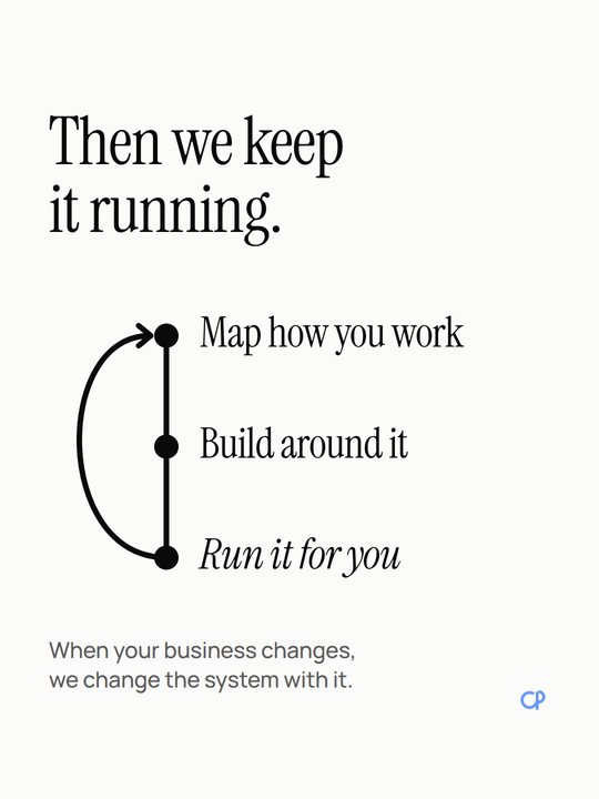
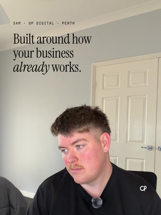
The words are my DRAFT, built from the one positioning line in the brief. Your own words replace them.
3A · The leaking line
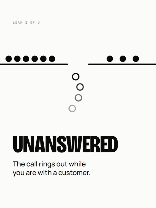
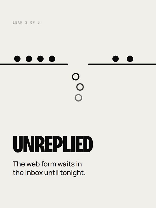
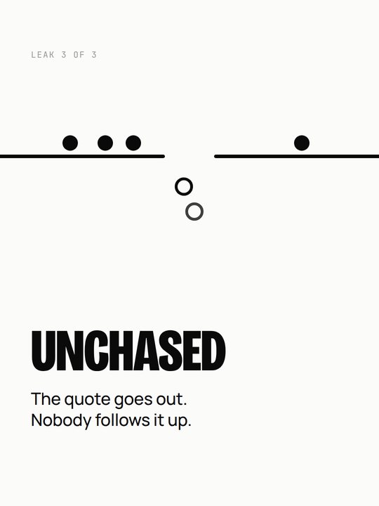
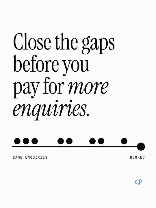
No numbers anywhere, so there is nothing to verify or invent.
More slidesisn't better content.
Movementthat explains.
The 3A cover as a 6-second loop: enquiries ride the line, most fall through the gaps, a few reach Booked. The first frame works as a still, because plenty of people never see it move.
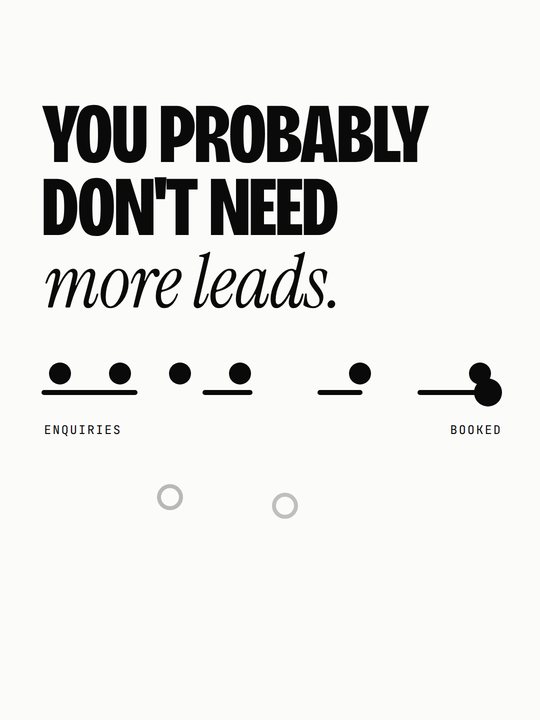
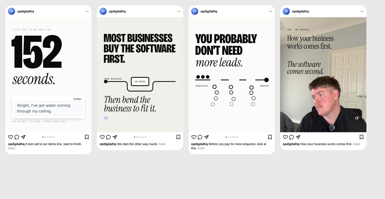
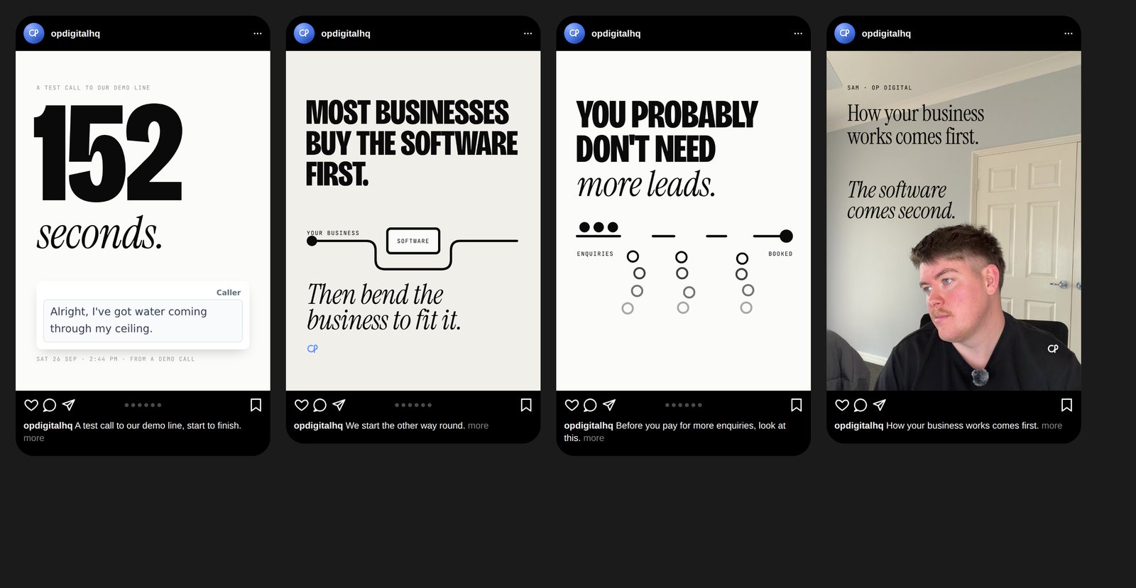
Checked whereit will live.
Our own plain frame at 390 pt, with no likes or counts. Swipe sideways.
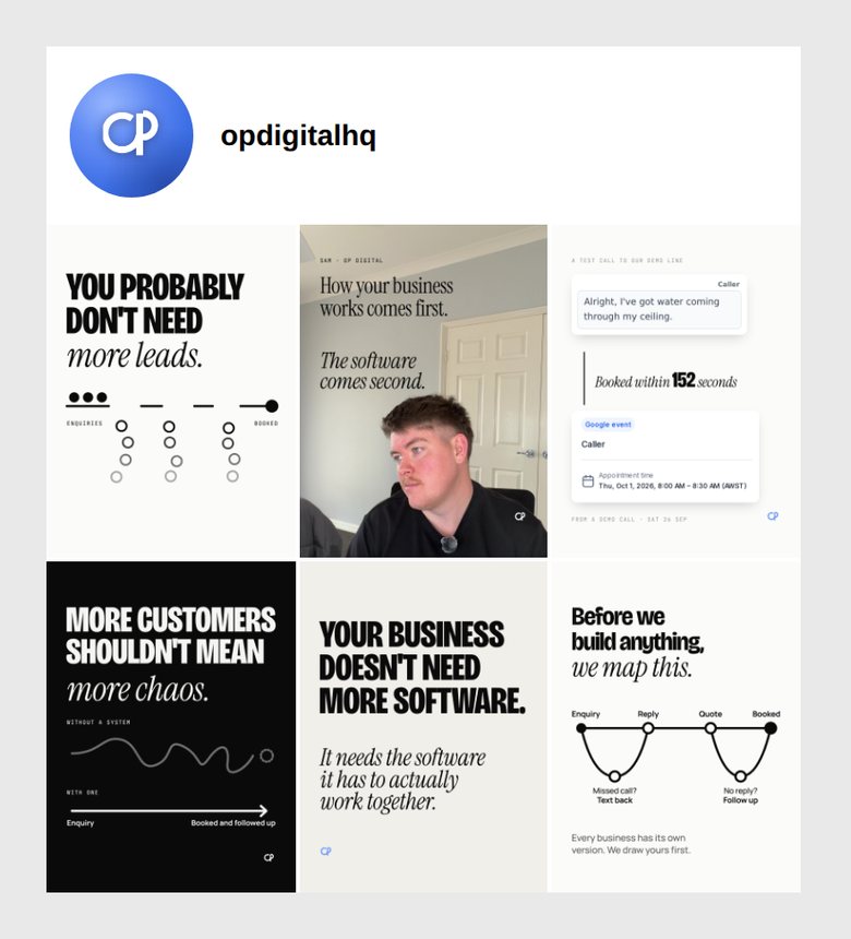
Profile grid
The first two versions broke the rule of an ink or photo tile in every row. This one follows it: six different posts, two of them carousels, no family twice running. It breaks one rule: only one post has you in it, because only one usable photo of you exists (asset gap 1). It is still mostly light, which is the energy question.
What the old onesstill do better.
29 Sep carousel vs 3A
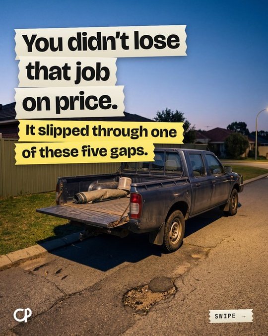
Old wins on energy and relevance at a glance. A ute at dusk is the buyer's world. V2 wins on trust: no AI scene pretending to be a job, one idea, and it looks like one company.
25 Sep creative map vs 1A
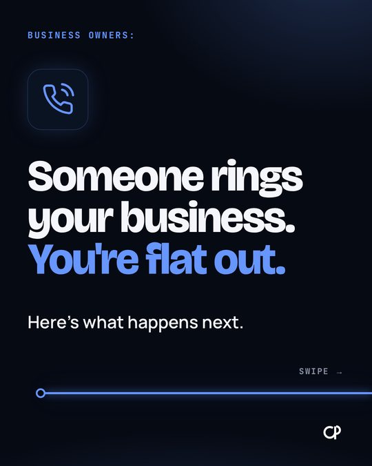
V2 wins outright: real proof instead of a glowing icon, and three times the scale contrast. You already called the old one boring.
23 Sep poster vs the same message in V2
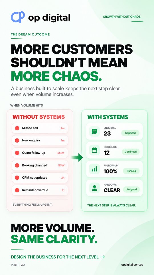
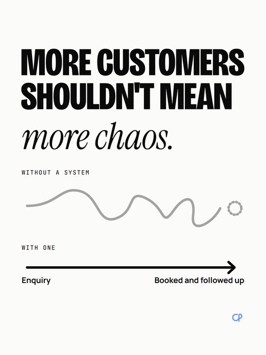
Old wins on density and polish: it looks like an ad, and the green is distinctive. V2 wins on honesty and legibility: no made-up dashboard numbers, one idea instead of eight.
The honest risk, plainly. By your own bar ("visual energy, not minimalism", "fill the frame") these stills are probably too quiet. The grid is 3 paper, 1 stone, 1 ink and 1 photo tile, only one post has you in it, and 1A's inside slides are small crops on paper. The fix is photography of you, the sharper proof captures and motion covers. Never decoration.
Taken fromwhat we already have.
- Kept: the brand guide's paper, ink and blue mark; Bricolage, Manrope and JetBrains Mono; the site's white cards on hairlines; TEST1's condensed caps with a serif italic second beat.
- Dropped: navy grounds, blueprint grid, grain and glow (your September rulings), Graphite and Geist (a motion-only decision), and the site's button blue (web only).
default
the pause
the turn
proof cards only
inside the logo only
- Energy comes from scale contrast (one thing at least 3x the next), real proof, your face and the ink flip. Never from decoration.
- Space, not void: empty space must have a job. An empty half with no job is a defect, per your "fill the frame".
- Proof: real crops of real screens, cut to the words that matter, on a white card with a true label ("From a demo call · Sat 26 Sep").
- Diagrams: dots, lines and gaps, one 10 px line weight (6 px vanished on a phone), never a slider or stepper look.
- Canvas: 1080x1440. The must-read content sits in the 4:5 centre, so one file also serves ads.
Same tokens,six ways to carry a post.
| Family | Carried by | OP example |
|---|---|---|
| Editorial | type | "Most businesses buy the software first." |
| Product | real UI crops | the test call transcript and calendar event |
| Founder | you | P1, you looking toward the line |
| Explain | the bold line | the enquiry line with three gaps |
| Story | time | 2:44 pm: answered, asked, booked, handed over |
| Motion | movement that explains | the 3A loop |
Format followsthe idea.
Ask in order and stop at the first yes:
- You're talking on camera: the Reel lane, which is a different skill.
- One sentence stands on its own: a text post, or a founder photo post.
- The proof is one screen: a product post.
- A mechanism fits one picture: a diagram post.
- A contrast needs a reveal: 2-4 slides.
- An event in order: 5-7 slides.
- A real method: 7-10 slides.
- Change over time is the point: a motion card.
Feed rhythm: four carousels at most in any nine posts, two with you in them, an ink or photo tile in every grid row.
Carousel shapes
Idea to explanation · problem to system · before and after · case study (never invented) · contrarian · a list (only a real one) · one line across the slides. People swipe because something is still unresolved, never because of an arrow.
The auditin six lines.
- No skill owns carousels or organic statics. Both recent looks are rejected (25 Sep "boring", 29 Sep "atrocious").
- Two skills that 14 files cite no longer exist (the scoring skill and
static-ad), so V2 owns scoring. - Four looks are live at once: the site, the navy brand guide, the motion work and the old IG grid, which is off-pivot.
- There's only one clean brand photo of you, the 680 px headshot. Everything else is video frames.
- Stays untouched:
op-static-ad,making-ads-with-codex,ad-factory,op-motion-ad,op-video-post, the ad-render engine and the IG publisher. - The 27 rules worth keeping are listed in the audit, from "slide 1 is the hook" to "never generate proof".
Research that shaped it
- Premium looks like restraint with one loud thing. The real product, cropped to the words that matter, is the picture.
- For an AI receptionist the natural picture is the conversation. For a process, it's time.
- Lock the copy before design, and lock slide 1 before the rest (the production mechanics from Ash H.'s video, without his structure or funnel).
- Instagram's organic max is now 3:4, the first image sets the ratio for the whole carousel, and API posts cap at 10, take JPEG only, and crop to the first image (square by default).
What would makethis better.
- One 30-minute photo session by a window: phone at 4K, no lav mic. Take each setup twice, once with the top third empty and once with a side third empty for type.
- At the laptop.
- On the phone, looking away.
- Relaxed to camera.
- Hands holding a real booking on the phone.
- Mapping an enquiry on a whiteboard.
- One portrait against a dark wall.
- Recapture the GHL proof at 2x. I can do this myself.
- Capture an SMS thread from a test contact on a fiction number. I can do this myself.
- Your own words for Test 2 and the founder posts.
- A carousel you like, as the reference.
- A working white lockup.
lockup-white.pngis solid white on every pixel, with no transparency, so it can't be used anywhere. Drive's Brand folder is locked. - Client proof, only after a client has paid in full and said yes.
- The 9 old IG posts: archive them when V2 starts? Never delete.
New files only,until you say so.
- Skill:
.claude/skills/op-carousel-director/, with the design language, families, router, shapes, QA, photography and a dated platform file as references. - Engine:
ad-render/social/, beside the existing renderer. It adds the 3:4 canvas, the automated QA, the phone preview and 2x proof crops. - Consults: the creative director agent, the script-taste rules once they exist, and for paid posts OP-PERFORMANCE-AD (proposed in the sibling package, not built yet; until then paid work goes to the working
op-static-adskill unchanged). Paid statics hand off toop-static-ad, longer motion toop-motion-ad, and publishing to the IG publisher only on your go.
| Step | What happens | Touches live? |
|---|---|---|
| Now | This proposal, on its branch | No |
| 1 | Your picks, then a spec, a plan, and the build | No, new files only |
| 2 | Two real posts made through it, sent to you on Telegram next to the old looks | No, nothing posts without your go |
| 3 | If V2 wins: old guidance is marked superseded with a pointer, never deleted | Docs only |
| 4 | Paid statics adopting V2 is its own decision | Only if you ask |
- Credible beside Anthropic or Linear? The Editorial and Explain covers, yes. The product crops need the 2x recapture first.
- Uniquely OP? Only where our own material carries it: the real demo call, the enquiry line, you.
- Understood by a business owner? Tests 1 and 3, yes. Test 2 is more abstract and worth a gut-check read.
- Could it be one post? Often, yes. P3 is Test 1 as one post.
- Taste, or AI discovered Canva? No tape, stickers, gradients or fake UI. The risk runs the other way: too quiet.
Full detail is in the repo at docs/agency/social-design-v2/PROPOSAL.md, with the audit, research, concepts and design references beside it.